CardGrid
Responsive card gallery container for repeated CardTile children.
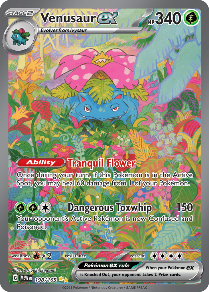
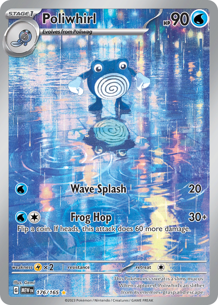
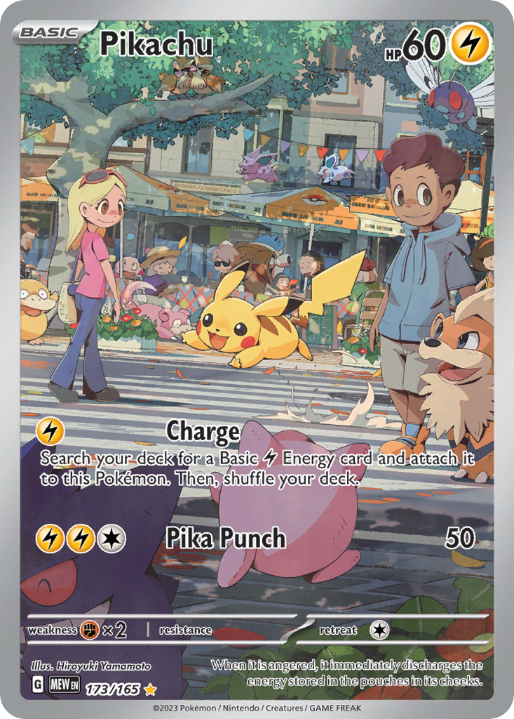
import { CardGrid, CardTile } from "@cardspark/ui/core"; const cards = [ { id: "mew-198", name: "Venusaur ex", set: "Scarlet & Violet 151", setCode: "MEW", number: "198/165", rarity: "Special Illustration Rare", condition: "Near Mint", marketValue: "$76.40", delta: "+4.1%", imageUrl: "https://images.pokemontcg.io/sv3pt5/198_hires.png", tone: "neutral" }, { id: "mew-176", name: "Poliwrath", set: "Scarlet & Violet 151", setCode: "MEW", number: "176/165", rarity: "Illustration Rare", condition: "Lightly Played", marketValue: "$15.72", delta: "+1.8%", imageUrl: "https://images.pokemontcg.io/sv3pt5/176_hires.png", tone: "water" }, { id: "mew-173", name: "Pikachu", set: "Scarlet & Violet 151", setCode: "MEW", number: "173/165", rarity: "Illustration Rare", condition: "Near Mint", marketValue: "$22.18", delta: "+2.6%", imageUrl: "https://images.pokemontcg.io/sv3pt5/173_hires.png", tone: "neutral" }, { id: "mew-181", name: "Dragonair", set: "Scarlet & Violet 151", setCode: "MEW", number: "181/165", rarity: "Illustration Rare", condition: "Near Mint", marketValue: "$18.34", delta: "+1.2%", imageUrl: "https://images.pokemontcg.io/sv3pt5/181_hires.png", tone: "water" }]; export function CardGridDemo() { return ( <CardGrid columns={3}> {cards.map((card) => ( <CardTile key={card.id} card={card} /> ))} </CardGrid> );}Installation
Install the package.
npm install @cardspark/uiImport the shared stylesheet layer near your app root.
app/layout.tsx
import "@cardspark/ui/tokens.css";import "@cardspark/ui/themes/basement.css";import "@cardspark/ui/styles.css";Import and render CardGrid from its package entry point.
Usage
CardGridDemo.tsx
import { CardGrid, CardTile } from "@cardspark/ui/core"; const cards = [ { id: "mew-198", name: "Venusaur ex", set: "Scarlet & Violet 151", setCode: "MEW", number: "198/165", rarity: "Special Illustration Rare", condition: "Near Mint", marketValue: "$76.40", delta: "+4.1%", imageUrl: "https://images.pokemontcg.io/sv3pt5/198_hires.png", tone: "neutral" }, { id: "mew-176", name: "Poliwrath", set: "Scarlet & Violet 151", setCode: "MEW", number: "176/165", rarity: "Illustration Rare", condition: "Lightly Played", marketValue: "$15.72", delta: "+1.8%", imageUrl: "https://images.pokemontcg.io/sv3pt5/176_hires.png", tone: "water" }, { id: "mew-173", name: "Pikachu", set: "Scarlet & Violet 151", setCode: "MEW", number: "173/165", rarity: "Illustration Rare", condition: "Near Mint", marketValue: "$22.18", delta: "+2.6%", imageUrl: "https://images.pokemontcg.io/sv3pt5/173_hires.png", tone: "neutral" }, { id: "mew-181", name: "Dragonair", set: "Scarlet & Violet 151", setCode: "MEW", number: "181/165", rarity: "Illustration Rare", condition: "Near Mint", marketValue: "$18.34", delta: "+1.2%", imageUrl: "https://images.pokemontcg.io/sv3pt5/181_hires.png", tone: "water" }]; export function CardGridDemo() { return ( <CardGrid columns={3}> {cards.map((card) => ( <CardTile key={card.id} card={card} /> ))} </CardGrid> );}Composition
Use this composition to build a complete card grid surface with filtering, sorting, and repeated cards.
CardGridSurface├── Header / result count├── FilterBar│ ├── Search│ ├── Condition│ ├── Rarity│ └── Sort└── CardGrid ├── CardTile │ ├── card art │ ├── name, set, number, and rarity │ └── value, delta, and condition └── Empty state / loading stateKeep filtering and sorting state outside the grid, pass the resulting card array into CardGrid, and let CardTile own each card's display details.
Features
- Accepts
childrensoCardTileor another card-shaped item owns artwork, metadata, value movement, condition, and fallback content. - Uses the
columnsprop for auto-fit by default or fixed 2, 3, and 4 column gallery modes when a surface needs tighter control. - Forwards its ref and native div props while search, filter, sort, loading, and empty states stay outside the grid API.
API Reference
| Prop | Type | Default | Description |
|---|---|---|---|
children | ReactNode | - | CardTile children to arrange. |
columns | 2 | 3 | 4 | auto-fit | Sets a fixed column count. |