Installation
Install Cardspark, configure its stylesheet layers, and render your first component.
Installation
Install the package.
npm install @cardspark/uiRequirements
Cardspark requires React 18 or newer and is published as an ESM package. Its visual components are Client Components.
- Server Components may render Cardspark components when their props are serializable.
- Event handlers and local interactive state must originate inside a Client Component.
- Use the server-safe
@cardspark/ui/utilsand@cardspark/ui/marketentrypoints for helper code that runs only on the server.
Load styles
Load the token layer first, a theme second, and the component stylesheet last. Import them once near your application root.
import "@cardspark/ui/tokens.css";import "@cardspark/ui/themes/basement.css";import "@cardspark/ui/styles.css";Basement is the bundled default theme. Load custom theme overrides after these imports so their semantic --cs-* variables win the cascade. See Theming for scoped themes and component overrides.
Render your first component
Import a component from its workflow lane and pass it stable card identity. If this tile renders with the Basement theme, package and stylesheet setup are complete.
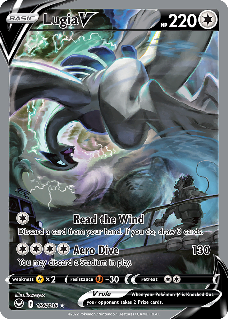
import { CardTile } from "@cardspark/ui/core"; const card = { id: "swsh12-186", name: "Lugia V", set: "Silver Tempest", setCode: "SIT", number: "186/195", rarity: "Special Illustration Rare", condition: "Near Mint", marketValue: "$214.75", delta: "+5.4%", imageUrl: "https://images.pokemontcg.io/swsh12/186_hires.png"}; export function ExampleCard() { return <CardTile format="market" card={card} tone="neutral" />;}Choose an import path
Prefer lane imports in application code so dependencies communicate the workflow they serve. The root @cardspark/ui entrypoint re-exports every lane for convenience.
import { CardTile, FilterBar } from "@cardspark/ui/core";import { CollectionSummary, SetSummary } from "@cardspark/ui/collecting";import { CardList, CardDetail } from "@cardspark/ui/layouts";import { resolveMarketHistoryDataSet } from "@cardspark/ui/market";import { formatConditionLabel, formatCurrency } from "@cardspark/ui/utils";corecontains reusable card, metadata, and filter primitives.collectingcontains ownership, collection summary, and set-progress surfaces.layoutscontains composed product surfaces such as CardList and CardDetail.marketcontains server-safe market-history selection helpers.utilscontains server-safe condition and USD formatting helpers.
Framework notes
Next.js App Router: import the global styles from app/layout.tsx. Add a "use client" boundary where callbacks or interactive state originate.
"use client"; import { CardTile } from "@cardspark/ui/core"; export function InteractiveCard({ card }) { return <CardTile format="market" card={card} onClick={() => {}} />;}Vite and standard React: import the same three styles from your root entry module, such as src/main.tsx. No framework-specific Cardspark plugin is required.
Package scope
Cardspark currently targets Pokémon collection interfaces, collection and set-progress workflows, USD market presentations, composed card layouts, and CSS-token theming.
- Canonical card data requires a stable
idandname; arrays use the ID for React identity. - Values such as
marketValue,price, andcostBasisare currently preformatted USD display strings. - Additional games, currencies, and locale-aware value adapters are outside the current package contract.
Licensing
@cardspark/ui is distributed under the PolyForm Noncommercial 1.0.0 license. Review the license before adopting the package for a commercial product.
Troubleshooting
- Components are unstyled: confirm that all three CSS entrypoints are imported once and in the documented order.
- Next.js rejects an event handler: move the interactive wrapper behind a
"use client"boundary. - An export cannot be resolved: use one of the documented root, core, collecting, layouts, market, or utils entrypoints.
- Server-only code pulls in UI: import helpers directly from
@cardspark/ui/utilsor@cardspark/ui/market.