CollectionSummary
Collection overview combining a value chart with optional portfolio metrics.
- Cards owned
- 342
- Average value
- $22.93
- Average cost
- $21.42
- Diversity
- 5.86%
- Rising

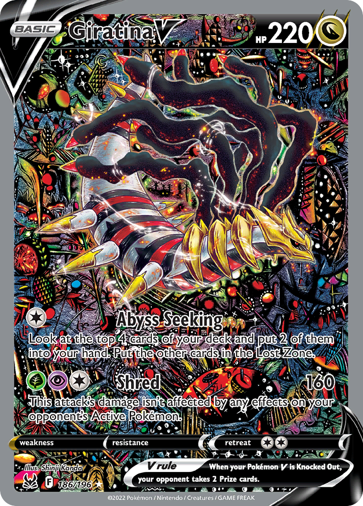
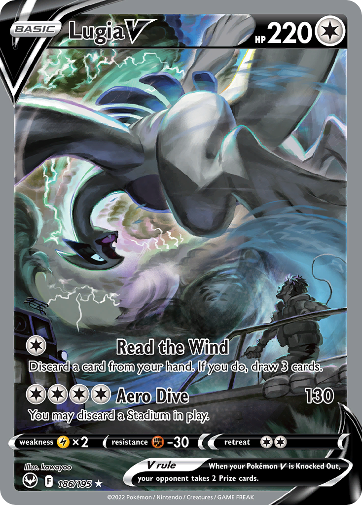
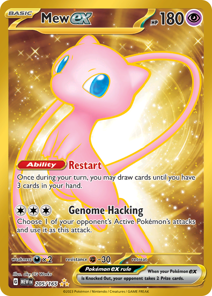
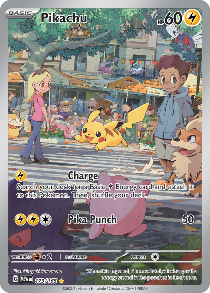
import { CollectionSummary } from "@cardspark/ui/collecting"; const collectionSummary = { title: "Collection", value: "$7,842.00", delta: "+6.4%", chartValues: [7210, 7310, 7280, 7450, 7580, 7810, 7842], previousCloseValue: 7370, metrics: [ { label: "Cards owned", value: "342" }, { label: "Average value", value: "$22.93" }, { label: "Average cost", value: "$21.42" }, { label: "Diversity", value: "5.86%" }, { label: "Rising", thumbnails: [ { id: "obf-223", name: "Charizard ex", price: "$118.90", delta: "+8.2%", imageUrl: "https://images.pokemontcg.io/obf/223_hires.png" }, { id: "swsh11-186", name: "Giratina V", price: "$392.10", delta: "+6.8%", imageUrl: "https://images.pokemontcg.io/swsh11/186_hires.png" }, { id: "swsh12-186", name: "Lugia V", price: "$214.75", delta: "+5.4%", imageUrl: "https://images.pokemontcg.io/swsh12/186_hires.png" }, { id: "mew-205", name: "Mew ex", price: "$66.25", delta: "+3.6%", imageUrl: "https://images.pokemontcg.io/sv3pt5/205_hires.png" } ] } ]}; export function CollectionSummaryDemo() { return <CollectionSummary {...collectionSummary} />;}Installation
Install the package.
npm install @cardspark/uiImport the shared stylesheet layer near your app root.
app/layout.tsx
import "@cardspark/ui/tokens.css";import "@cardspark/ui/themes/basement.css";import "@cardspark/ui/styles.css";Import and render CollectionSummary from its package entry point.
Usage
CollectionSummaryDemo.tsx
import { CollectionSummary } from "@cardspark/ui/collecting"; const collectionSummary = { title: "Collection", value: "$7,842.00", delta: "+6.4%", chartValues: [7210, 7310, 7280, 7450, 7580, 7810, 7842], previousCloseValue: 7370, metrics: [ { label: "Cards owned", value: "342" }, { label: "Average value", value: "$22.93" }, { label: "Average cost", value: "$21.42" }, { label: "Diversity", value: "5.86%" }, { label: "Rising", thumbnails: [ { id: "obf-223", name: "Charizard ex", price: "$118.90", delta: "+8.2%", imageUrl: "https://images.pokemontcg.io/obf/223_hires.png" }, { id: "swsh11-186", name: "Giratina V", price: "$392.10", delta: "+6.8%", imageUrl: "https://images.pokemontcg.io/swsh11/186_hires.png" }, { id: "swsh12-186", name: "Lugia V", price: "$214.75", delta: "+5.4%", imageUrl: "https://images.pokemontcg.io/swsh12/186_hires.png" }, { id: "mew-205", name: "Mew ex", price: "$66.25", delta: "+3.6%", imageUrl: "https://images.pokemontcg.io/sv3pt5/205_hires.png" } ] } ]}; export function CollectionSummaryDemo() { return <CollectionSummary {...collectionSummary} />;}Composition
Use CollectionSummary as the shared collection overview composite instead of rebuilding chart and metric stacks inline.
CollectionOverview├── CollectionSummary│ ├── chart cell│ │ └── range-driven value data│ └── metric cells│ ├── numeric values│ ├── percentages / deltas│ └── card thumbnail rails└── Downstream collection rows or gridsPass range data, metrics, and thumbnails as props so the same panel can power hero and workbench summaries.
Features
- Combines a collection chart cell with numeric, percentage, and card-rail metric cells.
- Uses shared collection value data for the chart, range controls, hover values, and delta state.
- Uses stable thumbnail ids and forwards native section props and refs.
API Reference
| Prop | Type | Default | Description |
|---|---|---|---|
title | string | - | Panel title label. |
value | string | - | Formatted collection value shown in the chart panel. |
delta | string | - | Formatted price or value movement. |
deltaDetail | string | - | Context label shown with the summary movement. |
description | string | - | Secondary explanatory copy rendered by the component. |
metrics | CollectionSummaryMetric[] | [] | Optional summary metrics; thumbnail metrics require a stable `id` for every card. |
chart | ReactNode | - | Optional custom chart or sparkline content. |
chartValues | number[] | - | Numeric values used to render the default value chart. |
chartRangeData | Partial<Record<string, CollectionValueRangeData>> | - | Per-range chart values and labels keyed by range name. |
ranges | string[] | - | Chart range options. |
activeRange | string | - | Currently selected chart range. |
onRangeChange | (range: string) => void | - | Callback fired when a chart range changes. |
emptyLabel | string | - | Fallback copy shown when chart or summary data is empty. |