CardTile
Collectible card tile with market and collection formats, compact metadata, value, and movement.
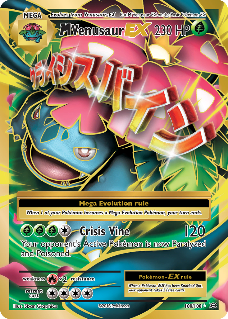
import { CardTile } from "@cardspark/ui/core"; const card = { id: "evo-100", name: "M Venusaur EX", set: "XY - Evolutions", setCode: "EVO", number: "100/108", rarity: "Ultra Rare", condition: "Lightly Played", marketValue: "$27.97", delta: "+2.16%", imageUrl: "https://images.pokemontcg.io/xy12/100_hires.png"}; export function CardTileMarketFormatDemo() { return <CardTile format="market" card={card} tone="neutral" />;}Installation
Install the package.
npm install @cardspark/uiImport the shared stylesheet layer near your app root.
app/layout.tsx
import "@cardspark/ui/tokens.css";import "@cardspark/ui/themes/basement.css";import "@cardspark/ui/styles.css";Import and render CardTile from its package entry point.
Usage
CardTileDemo.tsx
import { CardTile } from "@cardspark/ui/core"; const card = { id: "evo-100", name: "M Venusaur EX", set: "XY - Evolutions", setCode: "EVO", number: "100/108", rarity: "Ultra Rare", condition: "Lightly Played", marketValue: "$27.97", delta: "+2.16%", imageUrl: "https://images.pokemontcg.io/xy12/100_hires.png"}; export function CardTileMarketFormatDemo() { return <CardTile format="market" card={card} tone="neutral" />;}Composition
Use CardTile as the repeated child inside CardGrid or another card-shaped collection surface.
CardGrid└── CardTile ├── CardArt ├── title and value ├── CardBadgeStack │ └── CardBadge set / number / rarity / condition └── movementCardTile renders the main value and movement directly from card data.
Features
- Maps
card,format, and explicit overrides into the standardCardGridchild footer. - Uses
format="market"orformat="collection"to choose market value, collection value, and ownership display semantics. - Forwards its ref, native article props, and click event while
imageUrl,imageAlt, andtoneconfigure artwork treatment.
Examples
Market Format
Use `format="market"` for gallery cards that show current market value and movement from card data.
import { CardTile } from "@cardspark/ui/core"; const card = { id: "evo-100", name: "M Venusaur EX", set: "XY - Evolutions", setCode: "EVO", number: "100/108", rarity: "Ultra Rare", condition: "Lightly Played", marketValue: "$27.97", delta: "+2.16%", imageUrl: "https://images.pokemontcg.io/xy12/100_hires.png"}; export function CardTileMarketFormatDemo() { return <CardTile format="market" card={card} tone="neutral" />;}Collection Format
Use `format="collection"` for owned-card gallery cards that show collection value and ownership context.
import { CardTile } from "@cardspark/ui/core"; const card = { id: "evo-100", name: "M Venusaur EX", set: "XY - Evolutions", setCode: "EVO", number: "100/108", rarity: "Ultra Rare", condition: "Near Mint", collectionValue: "$35.80", costBasis: "$31.50", delta: "+13.7%", imageUrl: "https://images.pokemontcg.io/xy12/100_hires.png"}; export function CardTileCollectionFormatDemo() { return <CardTile format="collection" card={card} tone="neutral" />;}API Reference
| Prop | Type | Default | Description |
|---|---|---|---|
format | "market" | "collection" | "market" | Selects which card value fields and display semantics to use. |
card | TradingCardData | - | Canonical card object. Requires stable `id` and `name`; other presentation fields are optional. |
name, set, setCode, number, rarity, condition | string | - | Explicit identity props. These override fields from `card`. |
value | string | - | Formatted card value. Overrides `card.marketValue`, `card.collectionValue`, or `card.value`. |
delta | string | - | Formatted value movement. |
deltaPeriod | string | - | Delta tooltip period. |
imageUrl | string | - | Card art URL. Overrides `card.imageUrl`. |
imageAlt | string | - | Accessible image description. Overrides `card.imageAlt`. |
tone | "fire" | "electric" | "water" | "neutral" | "neutral" | Fallback and glow color treatment. |
onClick | (event: MouseEvent<HTMLElement>) => void | - | Native click event handler; also enables keyboard activation. |
ariaLabel | string | - | Accessible label for the interactive tile. |