CardList
Filterable card list layout with built-in grid and row stack view switching.
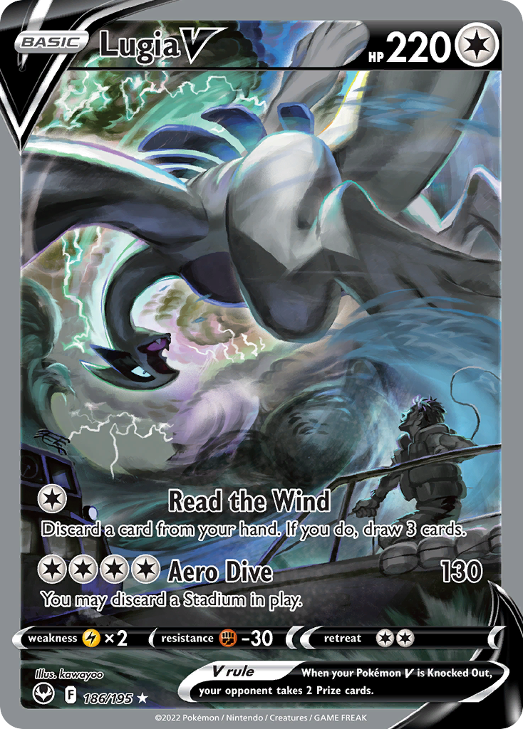
Lugia V
$214.75
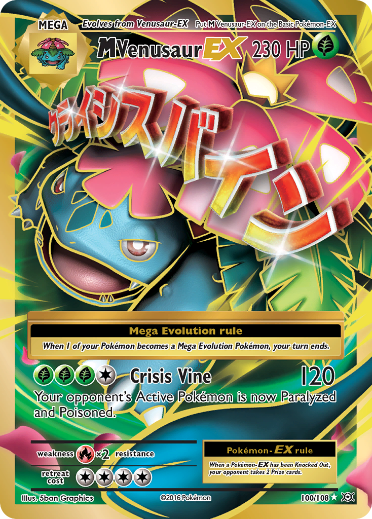
M Venusaur EX
$27.97
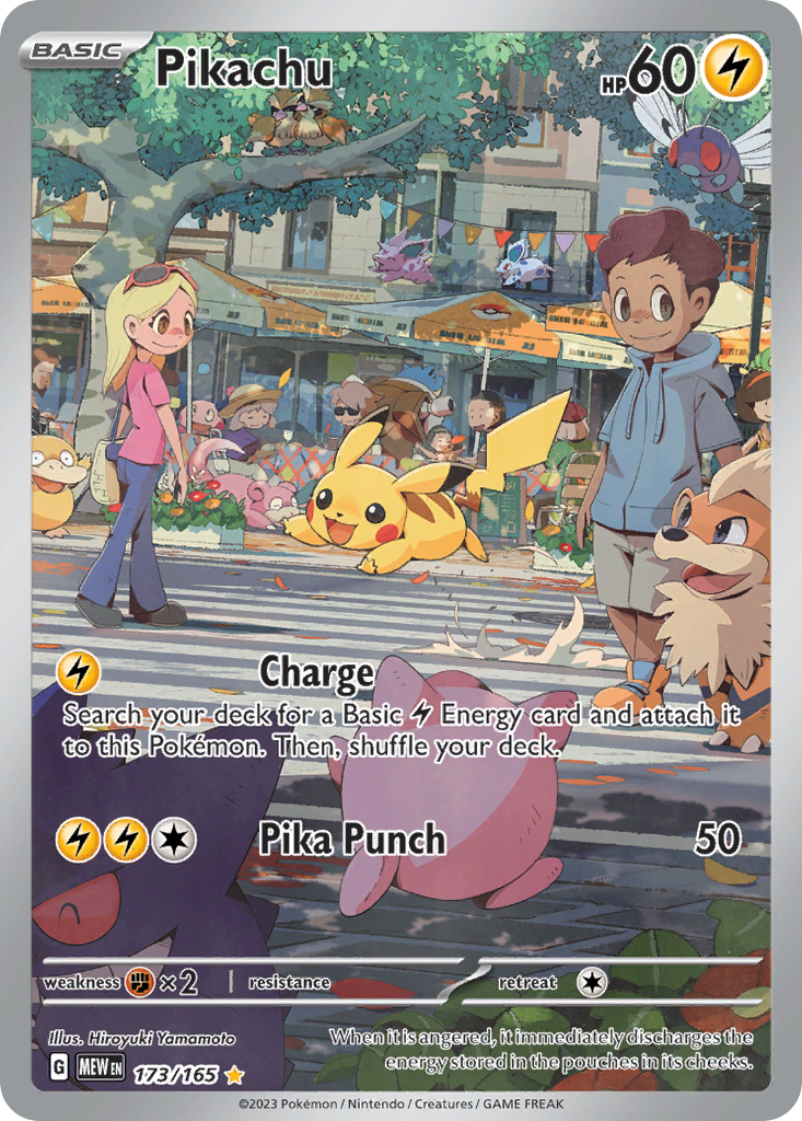
Pikachu
$31.40
"use client"; import { useMemo, useState } from "react";import { CardList } from "@cardspark/ui/layouts"; const cards = [ { id: "sit-186", name: "Lugia V", set: "Silver Tempest", setCode: "SIT", number: "186/195", rarity: "Special Illustration Rare", condition: "Near Mint", marketValue: "$214.75", delta: "+5.4%", imageUrl: "https://images.pokemontcg.io/swsh12/186_hires.png" }, { id: "evo-100", name: "M Venusaur EX", set: "XY - Evolutions", setCode: "EVO", number: "100/108", rarity: "Ultra Rare", condition: "Lightly Played", marketValue: "$27.97", delta: "+2.16%", imageUrl: "https://images.pokemontcg.io/xy12/100_hires.png" }, { id: "mew-173", name: "Pikachu", set: "Scarlet & Violet 151", setCode: "MEW", number: "173/165", rarity: "Illustration Rare", condition: "Near Mint", finish: "Reverse Holofoil", marketValue: "$31.40", delta: "+2.4%", imageUrl: "https://images.pokemontcg.io/sv3pt5/173_hires.png" }]; function getCardFilterValue(card, filterId) { switch (filterId) { case "set": return card.set; case "condition": return card.condition; case "rarity": return card.rarity; case "finish": return card.finish; default: return undefined; }} export function CollectionBrowserDemo() { const [filters, setFilters] = useState([ { id: "set", label: "Set", value: "All Sets", options: ["All Sets", "Scarlet & Violet 151", "Silver Tempest", "XY - Evolutions"] }, { id: "condition", label: "Condition", value: "All Conditions", options: ["All Conditions", "Near Mint", "Lightly Played"] }, { id: "rarity", label: "Rarity", value: "All Rarities", options: ["All Rarities", "Illustration Rare", "Special Illustration Rare", "Ultra Rare"] }, { id: "finish", label: "Finish", value: "All Finishes", options: ["All Finishes", "Holofoil", "Reverse Holofoil"] } ]); const visibleCards = useMemo(() => { return cards.filter((card) => filters.every((filter) => filter.value.startsWith("All ") || getCardFilterValue(card, filter.id) === filter.value) ); }, [filters]); return ( <CardList cards={visibleCards} filters={filters} onFilterChange={(id, selection) => { if (typeof selection !== "string") return; setFilters((currentFilters) => currentFilters.map((filter) => (filter.id === id ? { ...filter, value: selection } : filter)) ); }} format="market" gridColumns={3} /> );}Installation
Install the package.
npm install @cardspark/uiImport the shared stylesheet layer near your app root.
app/layout.tsx
import "@cardspark/ui/tokens.css";import "@cardspark/ui/themes/basement.css";import "@cardspark/ui/styles.css";Import and render CardList from its package entry point.
Usage
CardListDemo.tsx
"use client"; import { useMemo, useState } from "react";import { CardList } from "@cardspark/ui/layouts"; const cards = [ { id: "sit-186", name: "Lugia V", set: "Silver Tempest", setCode: "SIT", number: "186/195", rarity: "Special Illustration Rare", condition: "Near Mint", marketValue: "$214.75", delta: "+5.4%", imageUrl: "https://images.pokemontcg.io/swsh12/186_hires.png" }, { id: "evo-100", name: "M Venusaur EX", set: "XY - Evolutions", setCode: "EVO", number: "100/108", rarity: "Ultra Rare", condition: "Lightly Played", marketValue: "$27.97", delta: "+2.16%", imageUrl: "https://images.pokemontcg.io/xy12/100_hires.png" }, { id: "mew-173", name: "Pikachu", set: "Scarlet & Violet 151", setCode: "MEW", number: "173/165", rarity: "Illustration Rare", condition: "Near Mint", finish: "Reverse Holofoil", marketValue: "$31.40", delta: "+2.4%", imageUrl: "https://images.pokemontcg.io/sv3pt5/173_hires.png" }]; function getCardFilterValue(card, filterId) { switch (filterId) { case "set": return card.set; case "condition": return card.condition; case "rarity": return card.rarity; case "finish": return card.finish; default: return undefined; }} export function CollectionBrowserDemo() { const [filters, setFilters] = useState([ { id: "set", label: "Set", value: "All Sets", options: ["All Sets", "Scarlet & Violet 151", "Silver Tempest", "XY - Evolutions"] }, { id: "condition", label: "Condition", value: "All Conditions", options: ["All Conditions", "Near Mint", "Lightly Played"] }, { id: "rarity", label: "Rarity", value: "All Rarities", options: ["All Rarities", "Illustration Rare", "Special Illustration Rare", "Ultra Rare"] }, { id: "finish", label: "Finish", value: "All Finishes", options: ["All Finishes", "Holofoil", "Reverse Holofoil"] } ]); const visibleCards = useMemo(() => { return cards.filter((card) => filters.every((filter) => filter.value.startsWith("All ") || getCardFilterValue(card, filter.id) === filter.value) ); }, [filters]); return ( <CardList cards={visibleCards} filters={filters} onFilterChange={(id, selection) => { if (typeof selection !== "string") return; setFilters((currentFilters) => currentFilters.map((filter) => (filter.id === id ? { ...filter, value: selection } : filter)) ); }} format="market" gridColumns={3} /> );}Composition
Use CardList when a collection, set, or search page needs shared filters plus a switchable card grid or row stack.
CollectionView├── parent-owned query, sort, and filter state└── CardList ├── toolbar │ ├── FilterBar │ └── grid / rows view toggle ├── CardGrid │ └── CardTile items └── CardStack └── CardRow itemsKeep searching, sorting, pagination, loading, and empty-data decisions in the parent; CardList owns the display shell, empty-state slot, and optional view toggle.
Features
- Composes
FilterBarwithCardGridandCardStackfor collection and set list screens. - Uses
view,defaultView, andonViewChangefor controlled or uncontrolled grid and row-stack switching. - Uses canonical card ids for default keys, forwards section props and refs, and accepts custom tile and row renderers.
API Reference
| Prop | Type | Default | Description |
|---|---|---|---|
cards | TradingCardData[] | - | Canonical card records with stable ids, rendered as CardTile items or CardRow items. |
filters | FilterBarItem[] | [] | Filter definitions passed to the embedded FilterBar. |
onFilterChange | (id: string, selection: string | string[]) => void | - | Forwards embedded FilterBar changes with the active item's selection shape. |
filterActions | ReactNode | - | Extra action content rendered beside the list view toggle. |
format | "market" | "collection" | "market" | Card presentation format passed to the default CardTile and CardRow renderers. |
view | "grid" | "stack" | - | Controlled active list presentation. |
defaultView | "grid" | "stack" | "stack" | Initial list presentation when view is uncontrolled. |
onViewChange | (view: CardListView) => void | - | Callback fired when the grid or row-stack view changes. |
showViewToggle | boolean | true | Controls whether CardList renders the grid and rows toggle. |
gridColumns | 2 | 3 | 4 | auto-fit | Fixed grid column count passed to the embedded CardGrid. |
onCardClick | (card: TradingCardData, index: number, event: MouseEvent<HTMLElement>) => void | - | Callback fired with the card, position, and native click event. |
getCardKey | (card: TradingCardData, index: number) => Key | card.id | Custom key resolver for cards rendered by the list. |
renderTile | (card: TradingCardData, index: number) => ReactNode | - | Custom renderer used instead of the default CardTile in grid view. |
renderRow | (card: TradingCardData, index: number) => ReactNode | - | Custom renderer used instead of the default CardRow in row-stack view. |
tileProps | Omit<CardTileProps, "card" | "format"> | - | Props spread into the default CardTile renderer. |
rowProps | Omit<CardRowProps, "card" | "format"> | - | Props spread into the default CardRow renderer. |
emptyState | ReactNode | <p>No cards found.</p> | Content shown when the card array is empty after parent filtering. |