CardRow
Trading-card row with market and collection formats, inferred card metadata, value, and optional row content.
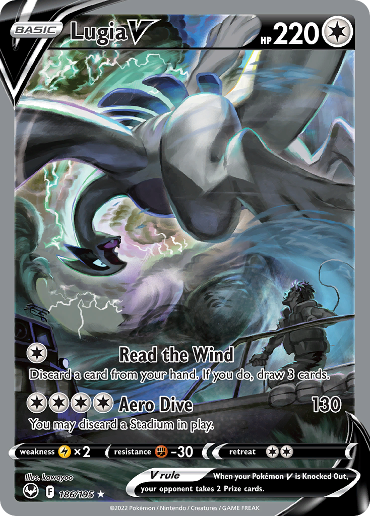
Lugia V
$214.75
import { CardRow } from "@cardspark/ui/core"; const card = { id: "sit-186", name: "Lugia V", set: "Silver Tempest", setCode: "SIT", number: "186/195", rarity: "Special Illustration Rare", condition: "Near Mint", marketValue: "$214.75", delta: "+5.4%", imageUrl: "https://images.pokemontcg.io/swsh12/186_hires.png"}; export function CardRowMarketFormatDemo() { return <CardRow format="market" card={card} />;}Installation
Install the package.
npm install @cardspark/uiImport the shared stylesheet layer near your app root.
app/layout.tsx
import "@cardspark/ui/tokens.css";import "@cardspark/ui/themes/basement.css";import "@cardspark/ui/styles.css";Import and render CardRow from its package entry point.
Usage
CardRowDemo.tsx
import { CardRow } from "@cardspark/ui/core"; const card = { id: "sit-186", name: "Lugia V", set: "Silver Tempest", setCode: "SIT", number: "186/195", rarity: "Special Illustration Rare", condition: "Near Mint", marketValue: "$214.75", delta: "+5.4%", imageUrl: "https://images.pokemontcg.io/swsh12/186_hires.png"}; export function CardRowMarketFormatDemo() { return <CardRow format="market" card={card} />;}Composition
Use CardRow as the shared formatted row for collection, market, and inventory surfaces.
RowList├── row data└── CardRow ├── CardArt thumbnail ├── title and details ├── CardBadgeStack │ └── CardBadge metadata └── value, chart, movement, or actionCardRow uses CardBadgeStack for the metadata run and keeps row-specific grouping, separators, and responsive tooltip behavior in its adapter.
Features
- Combines
card,format, inferred metadata,value,delta,chart, and actions in one reusable row contract. - Uses
format="market"orformat="collection"to choose value fields and collection details while preserving explicit overrides. - Forwards its ref and native article props, and becomes keyboard-accessible when
activeoronClickis provided.
Examples
Market Format
Use `format="market"` for watchlist rows that infer card metadata and show current value and movement.
Lugia V
$214.75
import { CardRow } from "@cardspark/ui/core"; const card = { id: "sit-186", name: "Lugia V", set: "Silver Tempest", setCode: "SIT", number: "186/195", rarity: "Special Illustration Rare", condition: "Near Mint", marketValue: "$214.75", delta: "+5.4%", imageUrl: "https://images.pokemontcg.io/swsh12/186_hires.png"}; export function CardRowMarketFormatDemo() { return <CardRow format="market" card={card} />;}Collection Format
Use `format="collection"` for owned-copy rows that infer card metadata and show collection value, cost basis, and date added.
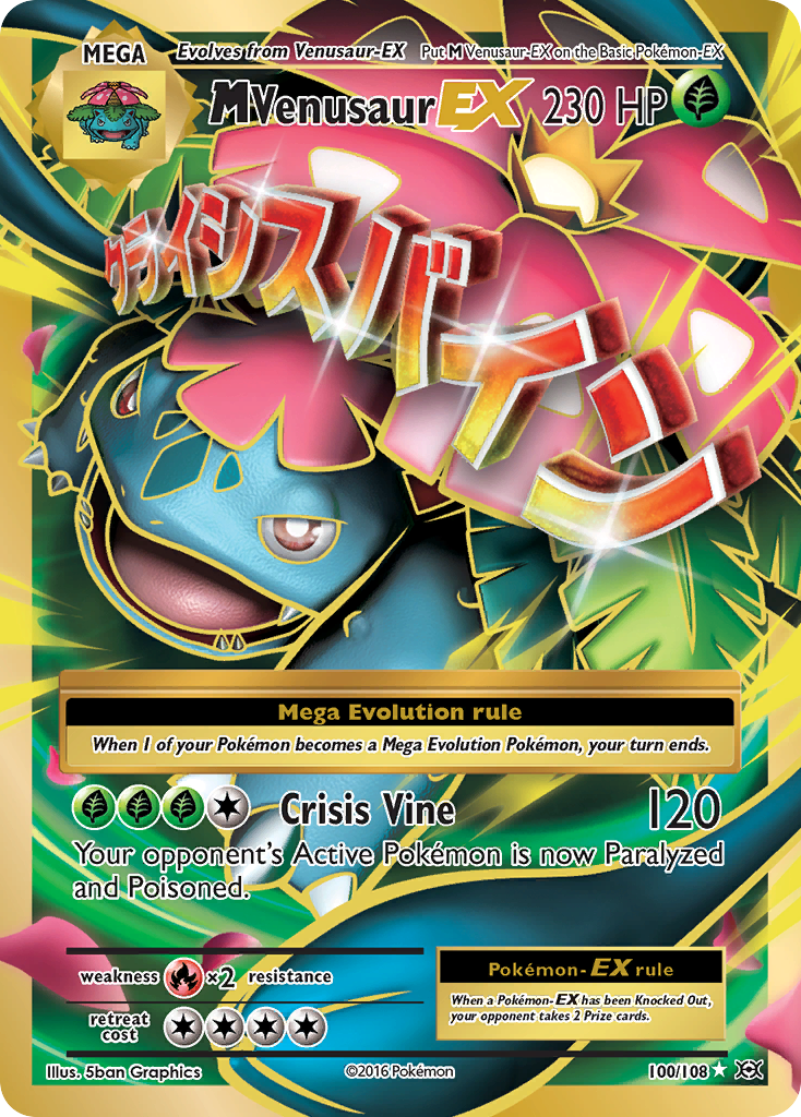
M Venusaur EX
May 30, 2026$31.50
$35.80
import { CardRow } from "@cardspark/ui/core"; const ownedCard = { id: "evo-100-owned", name: "M Venusaur EX", set: "XY - Evolutions", setCode: "EVO", number: "100/108", rarity: "Ultra Rare", condition: "Near Mint", dateAdded: "May 30, 2026", costBasis: "$31.50", value: "$35.80", delta: "+13.7%", imageUrl: "https://images.pokemontcg.io/xy12/100_hires.png"}; export function CardRowCollectionFormatDemo() { return <CardRow format="collection" card={ownedCard} />;}API Reference
| Prop | Type | Default | Description |
|---|---|---|---|
format | "market" | "collection" | "market" | Selects which card value fields and display semantics to use. |
card | TradingCardData | - | Canonical card object requiring stable `id` and `name`, with optional metadata, image, value, and collection fields. |
name | string | - | Primary row title. Overrides `card.name`. |
value | string | - | Formatted trailing value. Overrides inferred market or collection value. |
delta | string | - | Formatted price or value movement. |
deltaPeriod | string | - | Period label used in the movement tooltip. |
metadata | CardRowMetadataItem[] | [] | Metadata items rendered below a row title. |
chart | ReactNode | - | Optional custom chart or sparkline content. |
details | ReactNode | - | Optional secondary detail content rendered under the row title. |
action | ReactNode | - | Optional trailing action content rendered by the card row. |
active | boolean | false | Marks the row or item as the active selection. |
pricePosition | "at-market" | "below-market" | "above-market" | - | Relative price state rendered by a card row. |
onClick | MouseEventHandler<HTMLElement> | - | Optional native click handler that also enables keyboard activation where supported. |
ariaLabel | string | - | Accessible label for the component region or interactive card. |